Case study 04 • Product UX

Amazon India Web Checkout UX Evaluation & Redesign

An evidence-led evaluation of the Amazon India desktop web journey from cart through order confirmation and cancellation. The redesign concepts aim to make costs, choices, and recovery easier to understand.

FlowCart to cancellation
MethodHeuristic audit
Evidence7 captures
StatusDraft concepts

Download editable PowerPoint presentation (.pptx) · Download nine editable checkout designs (.pptx)

Independent educational UX case study. Not affiliated with or endorsed by Amazon. Seven genuine desktop-web screenshots were captured on 20 October 2026. One cash-on-delivery order was placed and immediately cancelled to document the confirmation and cancellation states. Personal address and payment details are excluded from the public images. No usability outcome was measured.

01 — Overview

One journey, clear checkpoints.

Observed web path: shopping cart → optional “Need anything else?” screen → payment selection, with a link to address selection → order review with delivery options. The cash-on-delivery order was placed and immediately cancelled; both resulting states were captured. The objective is to identify friction, propose clearer patterns, then test whether those patterns help shoppers complete a simulated purchase confidently.

CartItems & quantity
DeliveryAddress & speed
PaymentMethod & review
ReviewDelivery & total
02 — Research method

Evidence before conclusions.

Captured the signed-in Amazon India desktop website in Edge on 20 October 2026, following the flow through order confirmation and cancellation. Public crops exclude personal details; five display copies also remove only the browser cursor. Review each observation against Nielsen’s heuristics and relevant interaction laws. Follow with moderated usability sessions to test the redesign.

Evidence boundary.
These are genuine screenshots of the desktop website, not the mobile app. The address list contains private names, addresses and phone numbers, so only its heading is published. An order confirmation and successful cancellation were captured. A naturally encountered payment failure was not captured. Screenshots establish visible interface facts, not user impact or usability outcomes.
02.5 — Screenshots

Current web experience.

Captured in Edge on 20 October 2026. The images are cropped to exclude personal account, address and payment details. Stage order reflects this session; Amazon may vary checkout by item, account and payment method. Cash on delivery was selected; the order was cancelled immediately, before any payment or shipment.

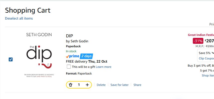
Amazon India web cart showing the selected book, price, quantity controls, delivery promise and coupon
Cart. The selected item, price, quantity controls and coupon appear together.
Amazon India checkout heading for selecting a delivery address, with six saved addresses indicated but no personal information shown
Address. The account had six address choices. The address list is withheld because it contains personal information.
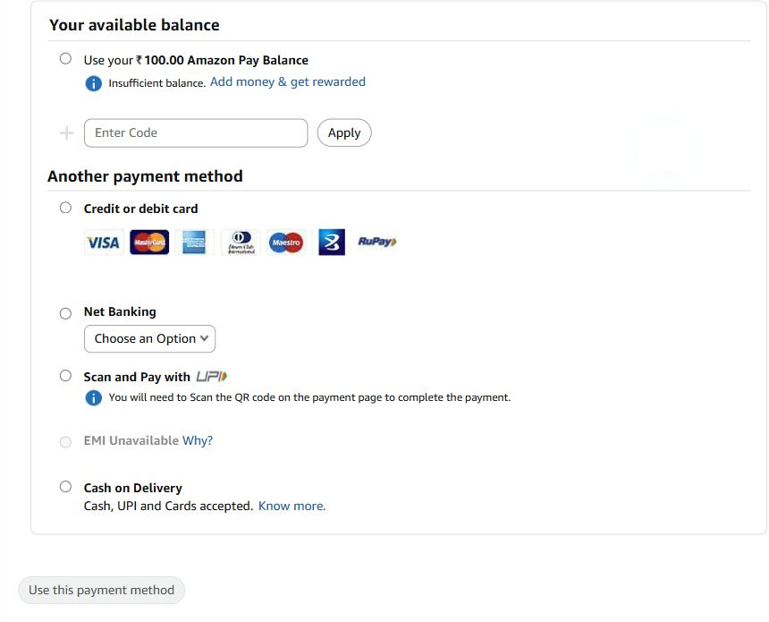
Amazon India web payment selection showing card, net banking, UPI scan and pay, and cash on delivery options
Payment. Multiple payment methods and an insufficient Amazon Pay balance are visible.
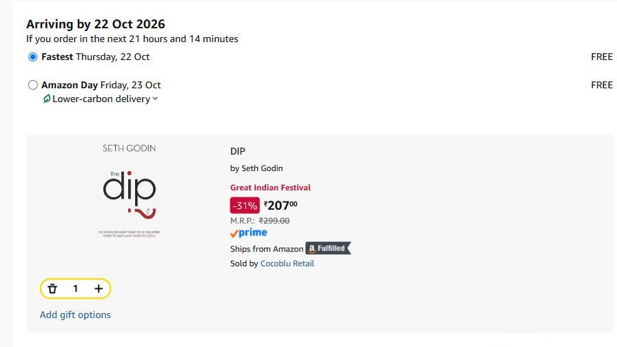
Order review showing Fastest and a later Friday delivery option, each marked free
Delivery. Fastest and a later Friday option are offered on the review page for this item.
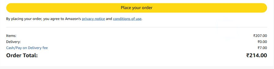
Order review total showing item price 207 rupees, free delivery, 7 rupee cash on delivery fee, and 214 rupee total
Review. The ₹7 cash on delivery fee raises the payable total from ₹207 to ₹214.
Amazon India web checkout message saying Order placed, thank you, with confirmation to follow by email
Confirmation. The order placed message appears after submitting the INR 214 cash-on-delivery order.
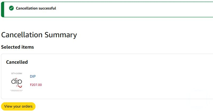
Amazon India cancellation summary showing Cancellation successful and the DIP book marked Cancelled
Cancellation. Amazon marked the selected book cancelled after the immediate cancellation request.

Five display crops have only browser cursor artifacts removed; the original captures are retained in the evidence folder. The screenshots establish visible checkout states, not a usability failure or measured outcome.

03 — Heuristic audit

Six testable hypotheses.

Severity uses Nielsen’s 0–4 scale. Scores are provisional triage estimates until screen evidence and user testing support them.

UX-01 · Review · Hypothesis · Provisional severity 3/4

Can shoppers verify the final payable amount?

Heuristic: Visibility of system status. Observed evidence: the review screenshot shows a ₹7 cash on delivery fee and ₹214 total; whether shoppers notice the change needs testing. Potential impact: uncertainty or abandonment at review. Proposed redesign: persistent, itemized summary with a clearly labeled final total.

UX-02 · Delivery/payment · Hypothesis · Provisional severity 2/4

Do competing messages slow decisions?

Heuristic: Aesthetic and minimalist design. Observed evidence: the cart presents coupon and promotional choices; checkout also showed a “Need anything else?” screen. Their effect on attention needs testing. Potential impact: longer decision time. Proposed redesign: group choices and reveal optional details on demand.

UX-03 · Address/review · Hypothesis · Provisional severity 3/4

Can shoppers edit without restarting?

Heuristic: User control and freedom. Observed evidence: the review page exposes Change links for address and payment; preservation of choices after editing needs testing. Potential impact: rework or accidental orders. Proposed redesign: contextual Edit links that retain state.

UX-04 · Payment · Hypothesis · Provisional severity 2/4

Are payment instructions clear to first-time shoppers?

Heuristic: Match between system and real world. Observed evidence: card, net banking, UPI scan and pay, and cash on delivery labels are visible; comprehension needs testing. Potential impact: hesitation or method selection errors. Proposed redesign: plain-language labels with concise explanations.

UX-05 · Payment failure · Hypothesis · Provisional severity 4/4

Does a failed payment explain recovery?

Heuristic: Help users recognize, diagnose and recover from errors. Evidence needed: a naturally encountered payment failure and recovery path; neither was captured. Potential impact: duplicate payment concern and lost orders. Proposed redesign: explicit transaction status, safe retry, and change-method actions.

UX-06 · All stages · Hypothesis · Provisional severity 2/4

Are primary controls easy to find and click?

Heuristic: Flexibility and efficiency of use. Evidence needed: target measurements and task observation. The cart and review captures show the controls. Potential impact: missed clicks or slower completion. Proposed redesign: prominent action labels and adequate click areas.

04 — UX laws

Design considerations.

Hick’s Law

More and more complex choices can increase decision time. For UX-02, group delivery and payment options, then disclose secondary detail as needed. Expected benefit: faster choice. A violation has not been verified.

Fitts’s Law

Small or distant targets are harder to acquire. For UX-06, give the primary action and Edit controls clear clickable areas. Expected benefit: fewer missed clicks. Actual targets still need measurement.

Jakob’s Law

Shoppers bring expectations from familiar checkout patterns. For UX-03, preserve choices and offer direct Edit controls on review. Expected benefit: more predictable navigation. This is a design consideration pending evidence.

05 — Before / after

Proposed redesign patterns.

“Before” uses genuine Amazon desktop screenshots. “After” is a proposed editable design concept. The recovery comparison has no original failure evidence.

Before hypothesis

Total, fees or discounts may need extra inspection before committing.

After concept

An always-readable order summary shows subtotal, delivery, savings and final payable amount. Why: it supports cost verification at the decision point.

Before hypothesis

Changing address or payment may require navigating away from review.

After concept

Contextual Edit controls open the relevant step and preserve earlier selections. Why: it reduces rework.

Before hypothesis

A payment failure may leave transaction status unclear.

After concept

A clear failed state explains whether payment was taken and offers safe retry or change method. Why: it supports recovery and trust.

06 — Priorities

Sequence by user risk.

P1 · Payment recoveryHighest potential trust and transaction risk; validate UX-05 with an observed failure flow before implementation.
P1 · Price clarityCheck whether the total is understandable at review; test an itemized summary.
P2 · Editing and choicesTest preserved state, grouping and terminology with first-time shoppers.
P3 · Control polishMeasure target size and task performance, then refine placement and labels.
07 — Validation

Five participant test plan.

Recruit five India-based desktop web shoppers with a mix of checkout familiarity and payment preferences. Ask each to update quantity, change address, choose delivery, review cost, choose a simulated payment method, recover from a simulated failure, and identify the confirmation state. Observe hesitation, wrong turns, missed controls, cost comprehension and recovery confidence. A task succeeds when the participant reaches the intended state without moderator help.

Limitations: small qualitative sample, simulated payment, no live Amazon transaction, no measured baseline. This plan has not yet been run. The current browser walkthrough is interface evidence, not a participant usability test.

Completion / abandonmentShare of started checkouts that complete / leave; baseline not measured.
Time and interactionsElapsed time and clicks to completion; baseline not measured.
Failure recoveryShare who resolve a simulated payment failure; baseline not measured.
Clarity and task successPost-task confidence rating and unaided task completion; baseline not measured.
08 — Learning

What this work teaches.

A useful UX audit separates observation from interpretation. Screenshot evidence should determine which issues are real; a prototype makes recommendations testable; task results should decide what to change next. The present concepts are ready for validation, not claims of improved checkout performance.